Newton's Colour Stories
Sumi-e Gallery: Direct Sales Temopera Gallery: Direct Sales
Art under 1000 € About me - Portrait/CV
Newton's primary colours
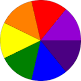
Newton thus found the seven primary colours red, orange, yellow, green, blue, "a violet-purple" and indigo. When mixing the coloured rays from a prism, he found that "the most surprising and wonderful composition was that of whiteness" requiring all the primary colours "mixed in a due proportion".
(Resouces: Wehlte, Winsor & Newton)
Newton's primary colors
Red
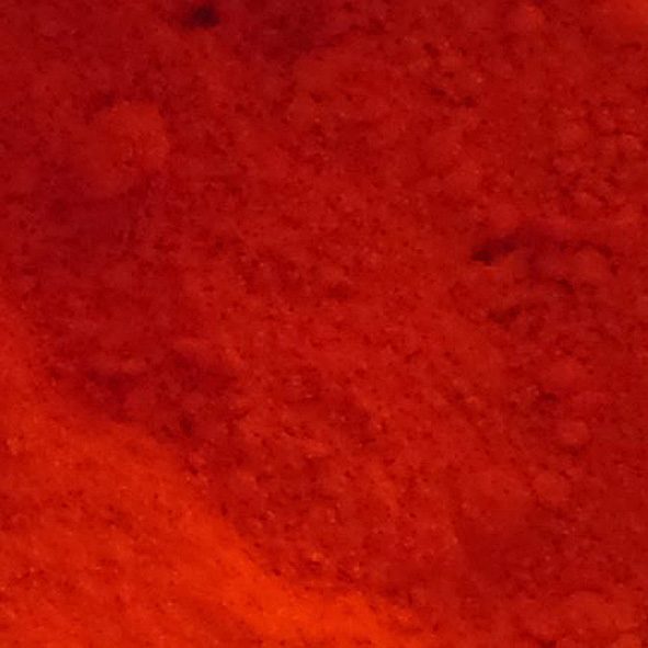
Cadmium Red, discovered in 1817, is prized for its brightness and opacity. Produced through controlled chemical reactions, it remains safe for artists despite cadmium's toxicity. This vibrant pigment is essential for creating bold, eye-catching works and serves as a reliable alternative to Vermilion.
Since red is the color of blood, it has historically been associated with sacrifice, danger, and courage. Modern surveys in Europe and the United States show red is also the color most commonly associated with heat, activity, passion, sexuality, anger, love, and joy. In China, India, and many other Asian countries it is the colour symbolizing happiness and good fortune.
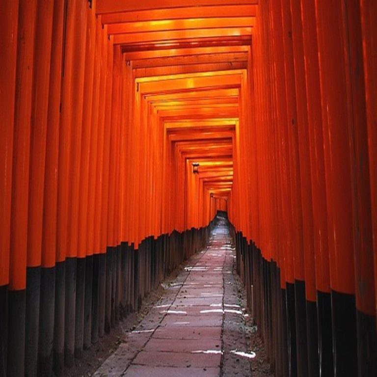
Vermilion, Asian red, is similar to scarlet, but slightly more orange (see next "orange"). Vermilion pigment, made from cinnabar. This was the pigment used in the murals of Pompeii and to colour Chinese lacquerware beginning in the Song dynasty. China is thought to have synthesised vermilion from mercury and sulphur – the earliest known description of this process dates from the 8th century. It became known as ‘China red’, and its impact was vast. The colour became a symbol of nobility, seen in the red lacquers used to paint royal palaces and red calligraphic ink reserved for emperors. It was also a colour that citizens saw in everyday life – vermilion was used in printing pastes for personal name stamps.
Many Asian countries use the color as a symbol of happiness.
(References: Wehlte, Winsor & Newton and Wikipedia)
Newton's primary colors
Orange
In ancient Greece, orange was connected to the god of hedonism and enjoyment – Bacchus, whereas in Hinduism, Confucianism and Buddhism it represents purity and spirituality.
Artists have been captivated by orange’s energy and intensity, from Mark Rothko to Henri Matisse and Georgia O'Keeffe.
Orange is rooted in Dutch culture due to its association with the Dutch Royal Family, the House of Orange (Huis van Oranje). As such, orange has been adopted as the national colour of The Netherlands.
Origins: Prior to the 15th century in Europe, before Spanish and Portuguese merchants imported the orange fruit to the continent, the colour was referred to as yellow-red.
In Buddhism, monks and holy figures wear bright saffron robes. Eventually, orange became the colour of the highest state of enlightenment in Buddhism. Orange is associated with the notion of spiritual transformation.
(References: Wehlte, Winsor & Newton)
Newton's primary colors
Yellow
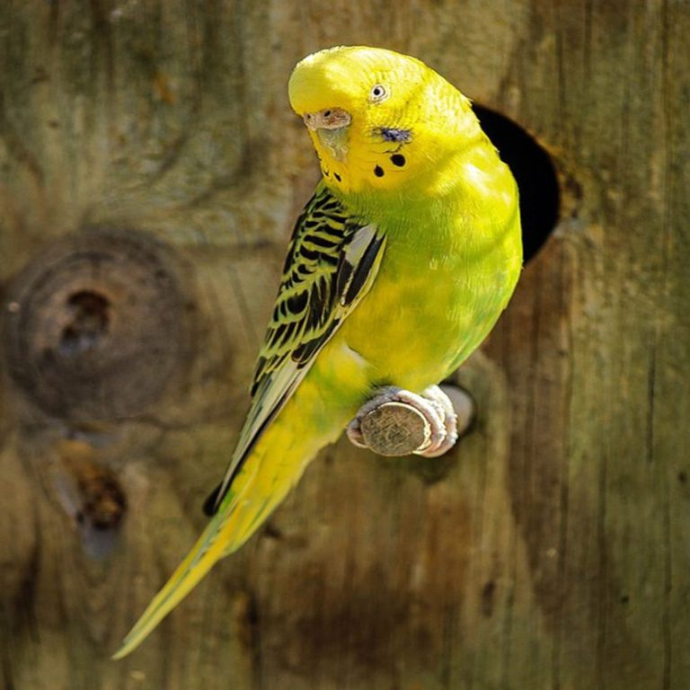
Yellow is the color between green and orange on the spectrum of light. It is evoked by light with a dominant wavelength of roughly 575–585 nm.
It was widely available, yellow ochre pigment was one of the first colours used in art; the Lascaux cave in France has a painting of a yellow horse 17,000 years old. Ochre and orpiment pigments were used to represent gold and skin color in Egyptian tombs, then in the murals in Roman villas. In the early Christian church, yellow was the colour associated with the Pope and the golden keys of the Kingdom.
According to surveys in Europe, Canada, the United States and elsewhere, yellow is the colour people most often associate with amusement, gentleness, humor, happiness, and spontaneity; however it can also be associated with duplicity, envy, jealousy, greed, justice, and, in the U.S., cowardice. In Iran it has connotations of pallor/sickness, but also wisdom and connection. In China and many Asian countries, it is seen as the color of happiness, glory, harmony and wisdom.
(References: Wehlte, Wikipedia)
Newton's primary colors
Green
Green is the colour between cyan and yellow on the visible spectrum. During post-classical and early modern Europe, green was the colour commonly associated with wealth, merchants, bankers, and the gentry, while red was reserved for the nobility. For this reason, the costume of the Mona Lisa by Leonardo da Vinci and the benches in the British House of Commons are green while those in the House of Lords are red. It also has a long historical tradition as the colour of Ireland and of Gaelic culture. It is the historic colour of Islam, representing the lush vegetation of Paradise. It was the colour of the banner of Muhammad, and is found in the flags of nearly all Islamic countries.
Green is the colour most commonly associated with nature, life, health, youth, spring, hope, and envy.
The first recorded use of the word as a colour term in Old English dates to approx. AD 700.
(References: Wehlte, Wikipedia)
Newton's primary colours
Ultramarin blue
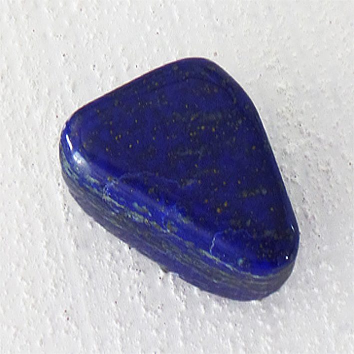
Ultramarine refers to as ‘true blue’. Its name derives from the combination of Latin for ‘ultra’ (beyond), and ‘mare’ (sea), referring to Europeans having imported the stone Lapis Lazuli (photo) from Afghanistan.
Because it was so costly to produce, ultramarine was once worth more than gold. Among Renaissance artists, Vermeer drove his family into debt because of his frequent ultramarine use.
It is one of the oldest blue pigments, and early evidence of ultramarine as a decorative stone in the cave temples of Bamiyan dates back to the 6th and 7th centuries AD.
(References: Wehlte, Winsor & Newton)
Prussian blue is darker than Indigo that Hokusai loves the color called "Bero-Ai" in Japanese. More
Newton's primary colors
Indigo
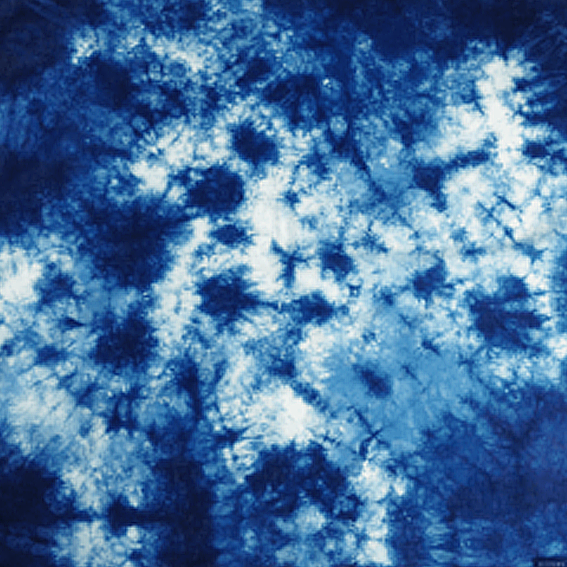
Indigo is one of the oldest dyes far back as ancient Mayan civilisations. For centuries, it has been used to colour textiles, particularly in countries such as India, Japan, Egypt and Peru.
Natural indigo dye comes from a plant that the colour is also named after – indigofera tinctoria. Extracting the dye: The plant would be packed where it softened and fermented. This dark substance was then skimmed, strained, pressed and dried into cakes, which formed the basis of indigo. (References: Wehlte, Bright Earth, Winsor & Newton)
Newton's primary colors
Violet
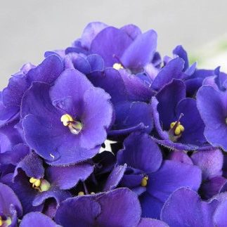
Violet sits on the very edge of the visible rainbow spectrum after which we find ultraviolet, which is invisible to most humans but can be seen by some insects and birds, for example, butterflies, who use Ultraviolet signals as a communication system for nectar guides and mating.
Originally, violet has been dyed from huge amounts of tiny snales. So, violet becomes very expensive colour to dye fabric. It became known as a colour of luxury and power.
Violet is also the colour strongly connected to Impressionism, with Monet, Pissarro and Manet abandoning the use of black for shadows and instead using tones of violet, seeing in shadows shades of colour rather than black or grey. This led to violet being dominant in their paintings and they were dubbed as having ‘Violettomania’. With Monet declaring “I have finally discovered the true colour of the atmosphere,” ...“It is violet. Fresh air is violet.”
Its scarcity as a natural pigment meant that in the past it was often reserved for royalty and the very wealthy.
(References: Wehlte, Wikipedia, Winsor & Newton)
Sumi-e Gallery: Direct Sales Temopera Gallery: Direct Sales
Art under 1000 € About me - Portrait/CV
